Web Forms
The Web Forms module enables you to create, manage, publish, and update online forms across the Regulatory Body platform. These forms can be connected to application settings, licensing procedures, registrations, and other workflows that involve gathering information from candidates or users.
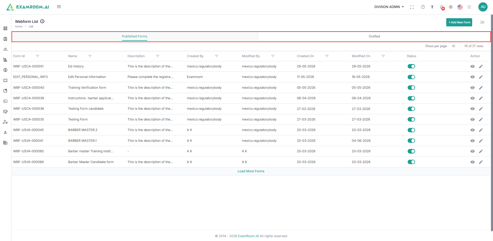
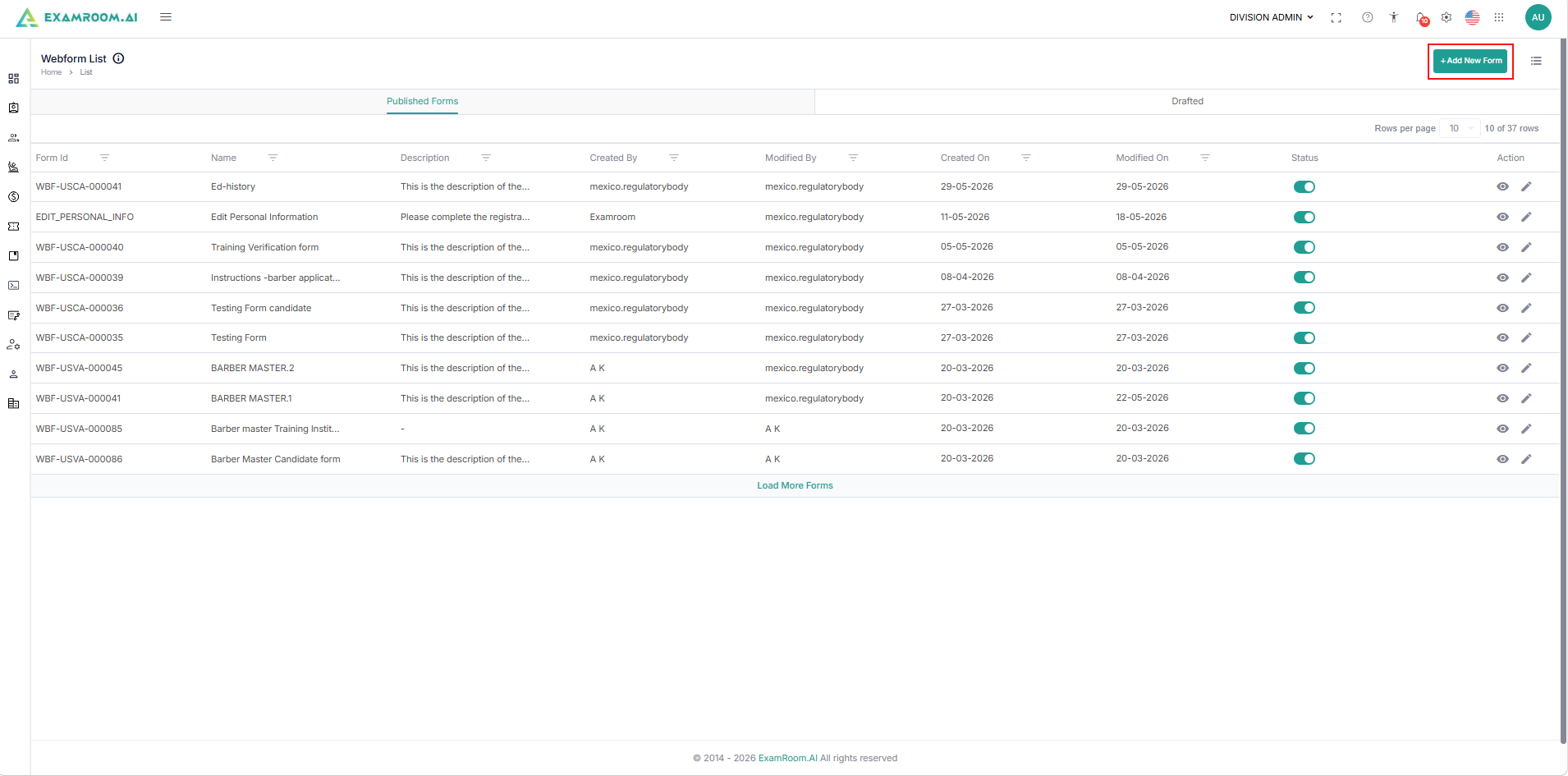
The Web Form List page provides a centralized view of all published and draft forms, along with their status and modification history.
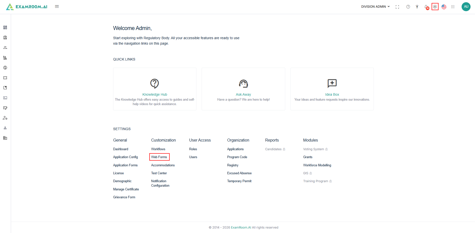
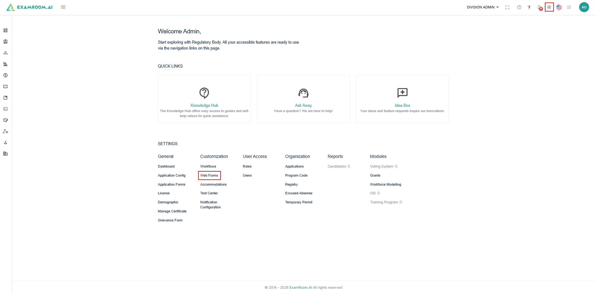
- After logging in to the RB portal, click the Settings icon provided at the top right side of the header.
- Select Web Forms, under customizations, to view the Web forms list.
View Web Forms
The Web Form List page displays all available web forms within the system. It includes two tabs: Published forms and Draft forms.
- Published Forms: Displays all forms currently available for use within the system.
- Drafted: Displays forms that have been saved but not yet published.
Follow the steps below to view and manage Web Forms:
- On the settings, click Web Forms, under customizations, to view the Web forms list.
- The Web forms are listed in the table format, and each form record includes the following information:
- Form ID: Unique identifier assigned to the web form.
- Name: Name of the web form.
- Description: Brief description of the form's purpose.
- Created By: User who originally created the form.
- Modified By: User who most recently updated the form.
- Created On: Date the form was created.
- Modified On: Date of the latest modification.
- Status: Indicates whether the form is published or in draft.
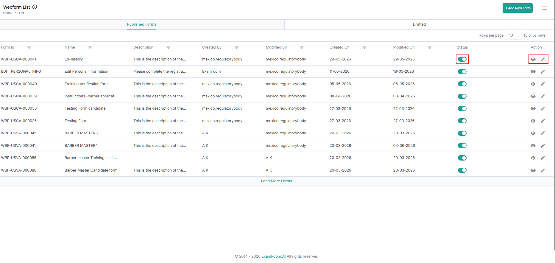
- Action: View and Edit icons are available.
- Click the View icon to preview the form.
- Click the Edit icon to modify the form.
- To know more about the options available for modifying the web form, refer to the " Add New " section.
Add New Forms
Adding a new form is basically creating a form to collect and manage user input. To ensure that the right information is collected, contact the requester to gather the specific details of the information they want to collect.
Once the details are collected, follow the steps outlined below to create a new form:
- Navigate to the Web Forms section from Settings.
- Click the +Add New Form icon, located in the upper right corner of the List of Forms page.
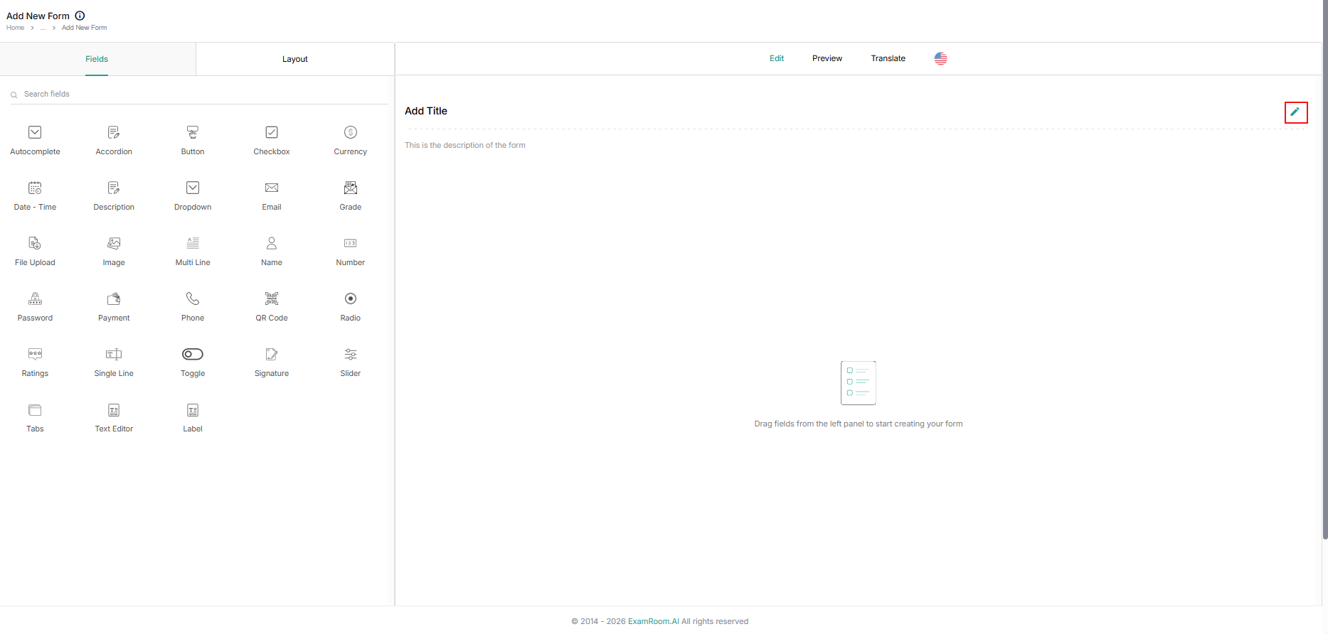
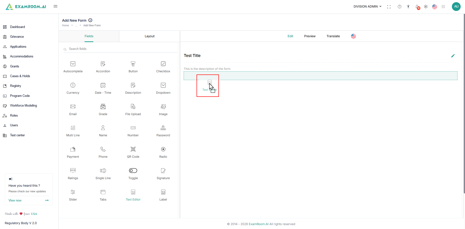
- The Add New Form page will appear, allowing you to create the form based on the required specifications. While there are no mandatory fields, it is recommended to include a title and description to facilitate the easy identification of the form within the list of forms. Follow the subsequent sub-steps to add a title and description.
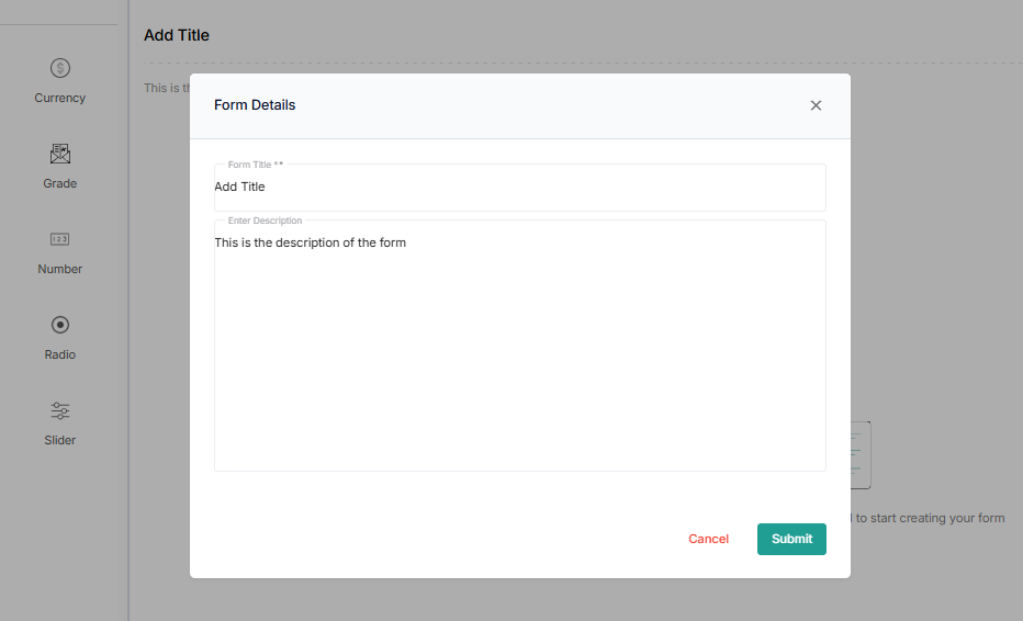
- To add a title and description, click the Edit icon within the Edit space of the Add New Form page.
- A Form Details pop-up will appear; enter the title and description within the designated fields.
- Click the Submit button to return to the Add New Form page with the saved information or click the Cancel button to continue without saving the information.
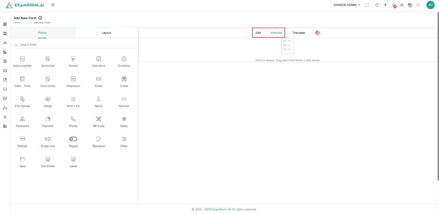
Note:- If at any time during creation of the form, you can preview the form by selecting the Preview tab on the Add New Form page.
- To continue editing the form, select the Edit Tab to switch back to edit mode.
- To add a title and description, click the Edit icon within the Edit space of the Add New Form page.
- Fields and Layout:
- The Fields tab contains all available form elements that can be added to the form. Refer to the Fields section to know more.
- The Layout tab contains structural components used to organize the form. Refer to the Layout section to know more.
- To add a field or layout to the edit section, use the Drag and Drop option (Build a Form Using Drag and Drop).
- Select the Fields tab or Layout tab.
- Locate the desired field or layout type.
- Drag the field or layout from the left panel.
- Drop it into the form editing area.
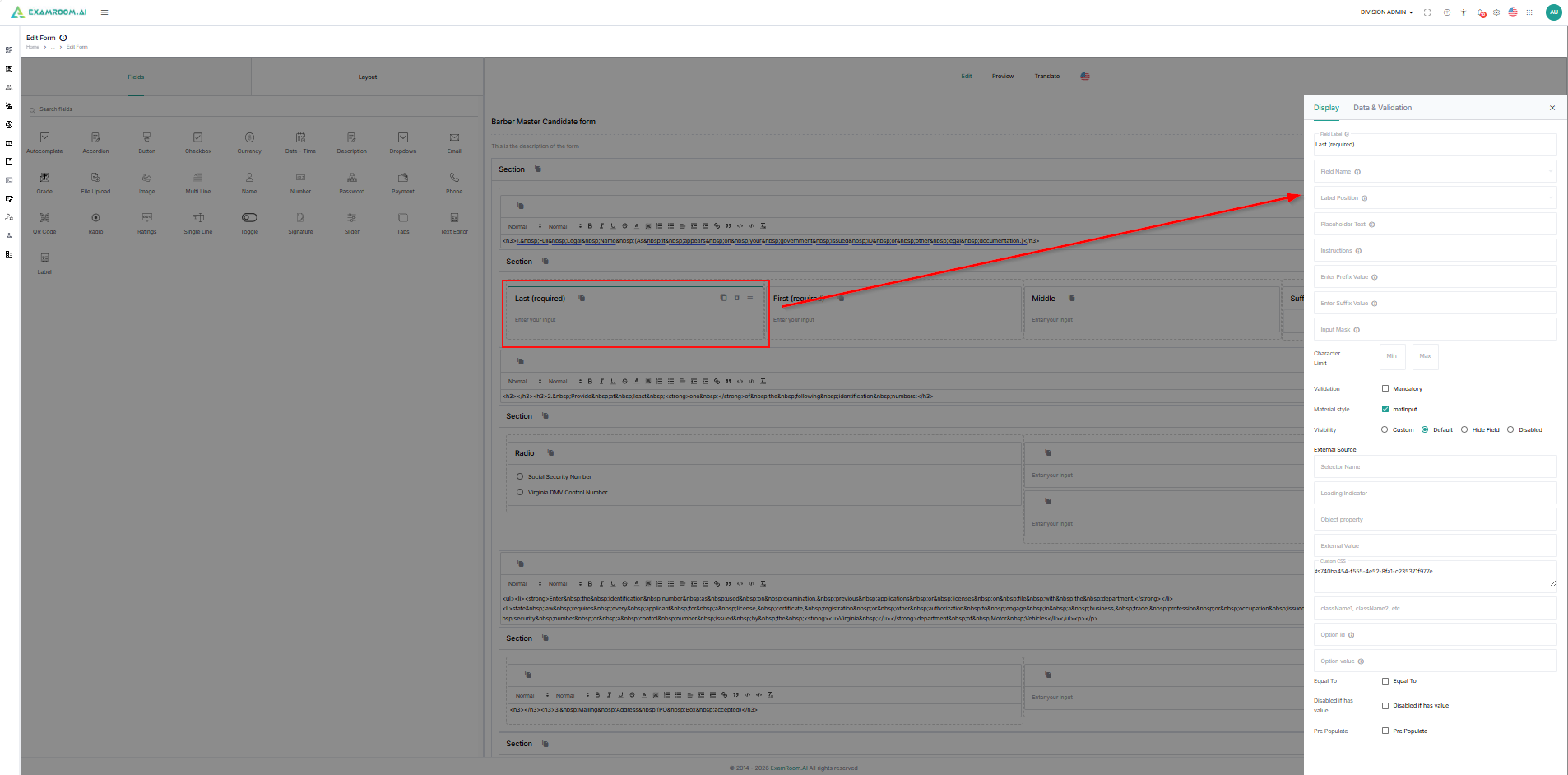
- Edit Form Components, once a field has been added:
- Select the field within the form.
- Configure its properties.
- Update labels, placeholders, validations, and required settings.
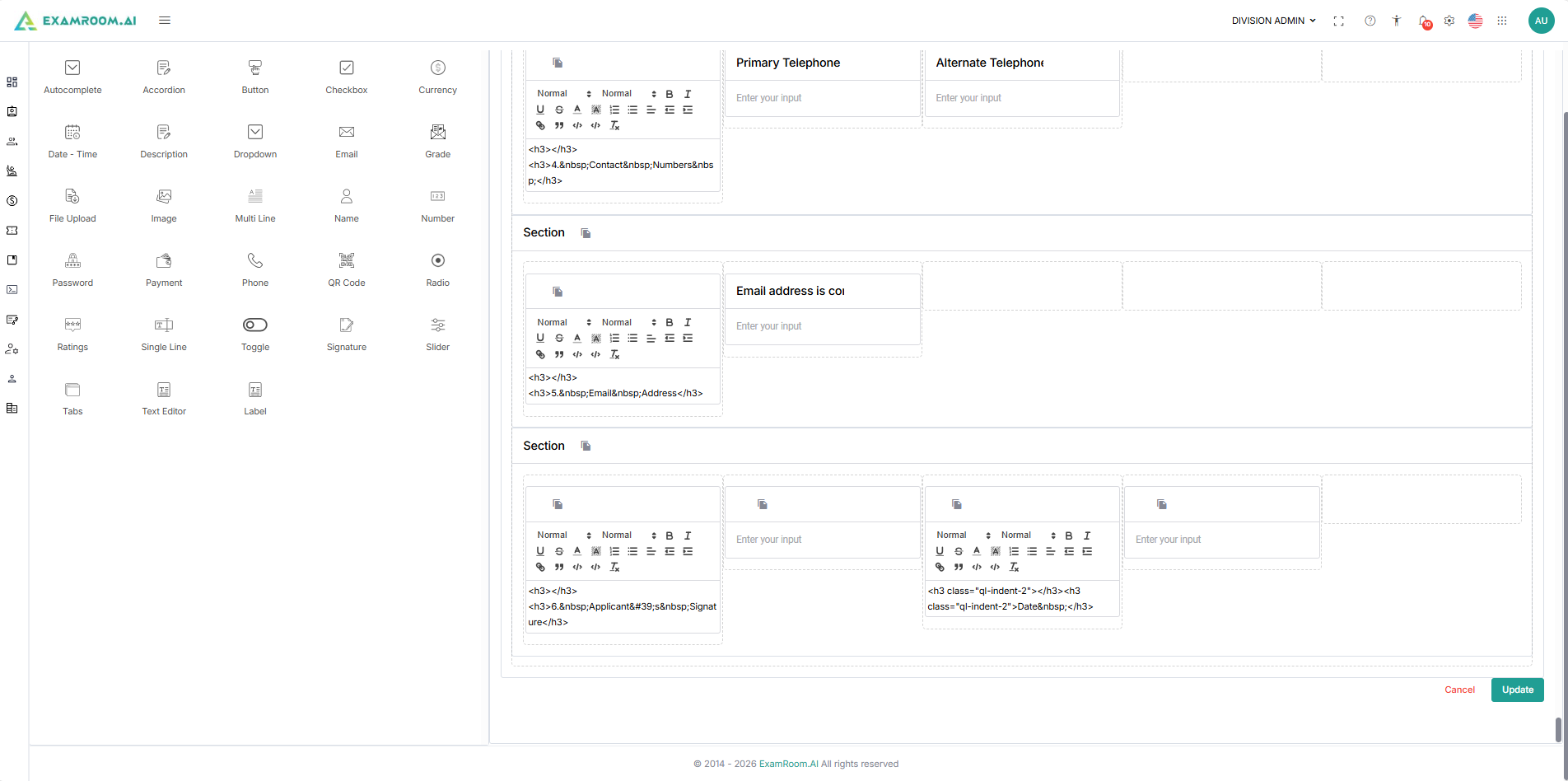
- Once the form is complete, click the Create/Update button to create or update the form or the Cancel button to disregard the form. Both buttons are located in the bottom-right corner of the page.
Note:
- The action buttons are only available in the Edit tab.
- The completed form is saved in the Drafted tab in inactive status.
- Go to the Drafted tab to find the created form.
- Click on the Toggle button under status to activate or publish the form. Once published, the form will appear on the Published Forms tab.
- The form, once created, cannot be deleted from the system. It is given a system-generated Form ID, and if you do not want to use the form. The form will stay in the drafted tab in an inactive status.
Fields
The Fields tab contains all available form elements that can be added to the form.
List of Fields
Below is the list of fields, along with their icons and descriptions.
| Field | Icon | Description |
| Address |  | Used to populate the address of the candidate (Street, City, State/Region/Province, Zip Code, and Country) |
| Autocomplete |  | Used to predict and suggest the rest of a word or phrase a user is typing |
| Accordion |  | Used to add additional information linked to the same questions (ex. Education History, Place of Residence History, and/or Job History) |
| Button |  | Used to facilitate event processing and user interaction, from form submission to accessing information |
| Checkbox |  | Used to select one or more options out of a group of options |
| Currency |  | Used to convert number inputs into currency |
| Date-Time |  | Used to open a date or time picker in an overlay (ex. DOB, Graduation Date) |
| Description |  | Used to describe the purpose of a button and help users determine if needed to activate it |
| Drop-Down |  | Used to let the user select from several items |
 | Used to have users input their email for communication purposes | |
| File Upload |  | Used to allow users to select a file from their computer and upload it to a server |
| Formula |  | Used to access a dialog box where they can easily select and insert various functions into their formulas |
| Image |  | Used to upload an image |
| Multi Line |  | Used to wrap text to multiple lines if the text string is too long to fit on a single line |
Layout
The Layout tab contains structural components used to organize the form. These elements help organize large forms into logical sections and improve the user experience.
List of available Layouts
Below is the list of layouts with their icon and description.
| Word | Icon | Definition |
| Columns |  | Used to insert columns (1-12) where fields can be inputted |
| Matrix Choice |  | Used to insert columns (1-12) that fields can be inputted |
| Page Break |  | Used to separate fields within the page |
| Section |  | Used to insert columns (1-12) that fields can be inputted. The sections can be moved to create rows of sections |
| Wallpaper |  | Used to add a background image to an element or the entire page |